wxiaoguang
1f026bcb7e
Fix dropdown icon position ( #27175 )
...
According to https://fomantic-ui.com/modules/dropdown.html and our
"devtest" page, many dropdown elements has incorrect "icon" position.

This PR fixes all of them. Fix #27173
2023-09-21 15:54:26 +00:00
silverwind
8099238618
Change green buttons to primary color ( #27099 )
...
I think it's better if the primary actions have primary color instead of
green which fits better into the overall single-color UI design. This PR
currently replaces every green button with primary:
<img width="141" alt="Screenshot 2023-09-16 at 14 07 59"
src="https://github.com/go-gitea/gitea/assets/115237/843c1e50-4fb2-4ec6-84ba-0efb9472dcbe ">
<img width="161" alt="Screenshot 2023-09-16 at 14 07 51"
src="https://github.com/go-gitea/gitea/assets/115237/9442195a-a3b2-4a42-b262-8377d6f5c0d1 ">
Modal actions now use uncolored/primary instead of previous green/red
colors. I also removed the box-shadow on all basic buttons:
<img width="259" alt="Screenshot 2023-09-16 at 14 16 39"
src="https://github.com/go-gitea/gitea/assets/115237/5beea529-127a-44b0-8d4c-afa7b034a490 ">
<img width="261" alt="Screenshot 2023-09-16 at 14 17 42"
src="https://github.com/go-gitea/gitea/assets/115237/4757f7b2-4d46-49bc-a797-38bb28437b88 ">
The change currently includes the "Merge PR" button, for which we might
want to make an exception to match the icon color there:
<img width="442" alt="Screenshot 2023-09-16 at 14 33 53"
src="https://github.com/go-gitea/gitea/assets/115237/993ac1a5-c94d-4895-b76c-0d872181a70b ">
2023-09-18 22:05:31 +00:00
puni9869
a50d9af876
Display archived labels specially when listing labels ( #26820 )
...
Follow up https://github.com/go-gitea/gitea/pull/26741

Changes:
Added archived label for org labels and added into issue filter list.


Part of https://github.com/go-gitea/gitea/issues/25237

---------

Signed-off-by: puni9869 <punitinani1@hotmail.com>
Co-authored-by: silverwind <me@silverwind.io>
2023-09-18 04:54:05 +00:00
wxiaoguang
e97baed800
Remove a gt-float-right and some unnecessary helpers ( #27110 )
...
Follow Remove polluted .ui.right #26825
Remove more `gt-float-right`, remove unnecessary helpers, remove
negative margin tricks.

2023-09-18 12:25:36 +08:00
Lunny Xiao
47b878858a
Search branches ( #27055 )
...
Resolve #25233
<img width="1315" alt="图片"
src="https://github.com/go-gitea/gitea/assets/81045/3ba59b58-471a-4e1b-985c-87edac2268c0 ">
<img width="1297" alt="图片"
src="https://github.com/go-gitea/gitea/assets/81045/b6caa12f-323b-4f70-9c44-ef91cb71a26c ">
2023-09-17 08:24:40 +00:00
KN4CK3R
ed64f1c2b8
Support .git-blame-ignore-revs file ( #26395 )
...
Closes #26329
This PR adds the ability to ignore revisions specified in the
`.git-blame-ignore-revs` file in the root of the repository.

The banner is displayed in this case. I intentionally did not add a UI
way to bypass the ignore file (same behaviour as Github) but you can add
`?bypass-blame-ignore=true` to the url manually.
---------
Co-authored-by: wxiaoguang <wxiaoguang@gmail.com>
2023-09-16 17:42:34 +00:00
KN4CK3R
c766140dad
Add RemoteAddress to mirrors ( #26952 )
...
This PR adds a new field `RemoteAddress` to both mirror types which
contains the sanitized remote address for easier (database) access to
that information. Will be used in the audit PR if merged.
2023-09-16 16:03:02 +00:00
KN4CK3R
f3f445862e
Use print instead of printf ( #27093 )
...
A bit more performant when we only use it for appending strings.
2023-09-16 03:51:54 +00:00
yp05327
076eca8158
Fix incorrect default branch label while switching between branches ( #27053 )
...
Fix #27008
2023-09-14 03:54:25 +00:00
Kerwin Bryant
a38eca3f52
Fix Fomantic's line-height causing vertical scrollbars to appear ( #26961 )
...
Before:

After:

---
1. **Remove the scroll bar exception that in the a tag**
2. **Reduce the actual width of the a tag to the actual width of the
content**

As shown in the screenshot, the red box area should not be clickable
2023-09-13 09:08:45 +00:00
wxiaoguang
739e47cd80
Improve repo/user/org search ( #27030 )
...
* Fix a regression from #26809 (the `data-org` is missing)
* Remove unnecessary style
Screenshots:


2023-09-12 16:44:48 +00:00
wxiaoguang
1875362383
Fix "delete" modal dialog for issue/PR ( #27015 )
...
Close #27012
By the way, rename the single-word ID to a long ID.


2023-09-11 17:06:05 +00:00
wxiaoguang
dd6e8ab57b
Improve "language stats" UI ( #26968 )
...
Before:
* The layout is quite complex
* The UI flickers when switch the stats (https://try.gitea.io/ )
After:
* Simplify the code
* The UI doesn't flicker
2023-09-10 18:27:23 +08:00
Lunny Xiao
9c0a3532a4
Add a new column schedule_id for action_run to track ( #26975 )
...
Fix #26971
And the UI now will display it's scheduled but not triggered by a push.
<img width="954" alt="图片"
src="https://github.com/go-gitea/gitea/assets/81045/d211845c-457e-4c3e-af1f-a0d654d3f365 ">
2023-09-08 23:01:19 +08:00
wxiaoguang
ffa4949eaa
Improve flex list UI ( #26970 )
...
1. There is already `gt-ac`, so no need to introduce `flex-item-center`
2. The `flex-item-baseline` and `.flex-item-icon svg { margin-top: 1px
}` seem to be a tricky patch, they don't resolve the root problem, and
still cause misalignment in some cases.
* The root problem is: the "icon" needs to align with the sibling
"title"
* So, make the "icon" and the "title" both have the same height
3. `flex-text-inline` could only be used if the element is really
"inline", otherwise its `vertical-align` would make the box size change.
In most cases, `flex-text-block` is good enough.

---------
Co-authored-by: silverwind <me@silverwind.io>
Co-authored-by: Giteabot <teabot@gitea.io>
2023-09-08 13:57:18 +00:00
wxiaoguang
419003adb2
Improve SSH Key / GPG Key / Deploy Key UI ( #26949 )
...
1. In many cases, the `flex-list` has previous and next `gt-hidden`
siblings, so relax the CSS selector to remove all ".segument .flex-list"
paddings.
2. Make the "Add key" button can toggle
3. Move help message into the related segment(panel). Otherwise users
would misread the message, eg: the SSH help seemed for GPG because they
are so near
4. Move modal element into the segment element, otherwise it affects the
layout
2023-09-07 01:13:11 +00:00
Kerwin Bryant
9b0743ae33
Extract common code to new template ( #26933 )
...
Same as #26903
2023-09-06 10:11:06 +00:00
Kerwin Bryant
65588b732c
Extract common code to new template ( #26903 )
...
I noticed that the code of several new webhook pages is highly
repetitive, so I pulled out the common parts to a new template, unified
reference, unified maintenance

---------

Co-authored-by: KN4CK3R <admin@oldschoolhack.me>
2023-09-05 12:00:28 +00:00
wxiaoguang
682552378f
More fixes for the "commit-body" ( #26898 )
...
The changes for "commit-body" in #26877 are not ideal.

The reason is: the "commit-body" is usually a `<pre>`, it has default
margins. In most cases, we do not need that large margin. So, this PR
introduces a general but small margin for all "commit-body" elements.
Then these `gt-m-0` could be removed.

The `:not` selector is not needed, because the `.timeline-item` selector
is already clear enough.
2023-09-04 13:38:59 +00:00
wxiaoguang
51cfe0e7de
Remove CSS has selector and improve various styles ( #26891 )
...
Replace #26850
Major changes:
1. Remove all `has` selectors, it is still not supported by firefox.
Actually there could be some more general and clearer approaches
2. Remove `two-toggle-buttons`, the `.ui.buttons` just works well
3. Rewrite the `.ui.buttons` border styles, see the screenshots
4. Remove the "fine-tuning" paddings from the the flex children, they
could layout themselves well.


2023-09-04 18:22:46 +08:00
wxiaoguang
fba7150ca9
Refactor "shortsha" ( #26877 )
...
The old code used complex `if` blocks and strange HTML layouts.
<details>

</details>
This PR refactors the template code and remove legacy CSS styles. The UI
doesn't change much.


2023-09-03 02:58:52 +00:00
silverwind
a625f3a761
Enable djlint H008 and fix issues ( #26869 )
...
Enable `H008 | Attributes should be double quoted` and fix issues.
2023-09-01 17:32:39 +00:00
silverwind
9b76df53dc
Minor dashboard tweaks, fix flex-list margins ( #26829 )
...
Some small dashboard tweaks:
- Remove margin-bottom from divider so first item does not appear to
have un-equal margins
- Restore previous icon color
- Add slight margin-right to icon
Before:
<img width="783" alt="Screenshot 2023-08-31 at 00 10 28"
src="https://github.com/go-gitea/gitea/assets/115237/b75f70d7-8704-4afb-866d-fea0484c52d4 ">
After:
<img width="783" alt="Screenshot 2023-08-31 at 00 10 08"
src="https://github.com/go-gitea/gitea/assets/115237/50ed0c47-6f7c-449e-a054-13091369d43f ">
---------
Co-authored-by: wxiaoguang <wxiaoguang@gmail.com>
2023-08-31 21:28:45 +00:00
wxiaoguang
d5703d4a1b
Remove "TODO" tasks from CSS file ( #26835 )
...
1. Use `gt-invisible` instead of `invisible`.
2. Use `gt-word-break` instead of `dont-break-out` (there is a slight
different "hyphens", but I think it won't affect too much since it is
only used for the "full name").
3. Remove `.small.button:has(svg)` , now our buttons could layout SVG
correctly, and actually I didn't see this CSS class is used in code.
2023-08-31 10:49:53 +00:00
silverwind
3d109861dd
Render code blocks in repo description ( #26830 )
...
Backtick syntax now works in repo description too. Also, I replaced the
CSS for this was a new single class, making it more flexible and not
dependent on a parent. Also, very slightly reduced font size from 16.8px
to 16px.

---------

Co-authored-by: wxiaoguang <wxiaoguang@gmail.com>
2023-08-31 05:01:01 +00:00
wxiaoguang
19a1e1b20e
Remove polluted .ui.right ( #26825 )
...
Each change is tested manually line by line. There are too many changes
so I can't share dozens of screenshots.

In short:

1. `ui right` could be still used in `ui top attached header`, because
there is a special case.
2. A lot of `ui right` are just no-op, so they can be removed safely.
3. Some of the `ui right` should be replaced by `gt-float-right` (to
avoid breaking, leave them to the future).
4. A few of the `ui right` could be rewritten by flex.
2023-08-31 02:29:59 +00:00
wxiaoguang
1bb9b1c4d9
Remove polluted ".ui.left" style ( #26809 )
2023-08-30 21:46:24 +08:00
yp05327
008f5d8cf1
Add default label in branch select list ( #26697 )
2023-08-29 12:15:19 +00:00
CaiCandong
c576b50441
Fix being unable to use a repo that prohibits accepting PRs as a PR source. ( #26785 )
...
## Description
Sometimes, we need to use an upstream mirror repository to update the
current development repository, but mirror repositories are prohibited
from PR. It should not appear in `merge to,` but it can appear in `pull
from.`
Fix #24585 #26193 #26781
Related #24183
Many thanks to @apnote for assisting me in reproducing this bug!
## ScreenShot
---
### Before
<img
src="https://github.com/go-gitea/gitea/assets/50507092/3d76c376-1f54-45b9-80c9-6ba8319d6a9a "
width="400px">
<img
src="https://github.com/go-gitea/gitea/assets/50507092/fbfd9f7f-421f-4a2e-9a3e-f2958bbf3312 "
width="400px">
### After
<img
src="https://github.com/go-gitea/gitea/assets/50507092/e6984524-4f61-4310-b795-4d8598bd8963 "
width="400px">
<img
src="https://github.com/go-gitea/gitea/assets/50507092/04065b44-78d7-4721-bf31-0f1674150727 "
width="400px">
2023-08-29 12:07:15 +03:00
wxiaoguang
4803766f7a
Refactor some CSS styles and simplify code ( #26771 )
...
Refactor some CSS styles and simplify code.

Some styles are not in use, remove them.
2023-08-28 22:14:51 +08:00
wxiaoguang
67daa7bcb0
Remove some transition related code ( #26755 )
...
Remove transition related code because the transition module has been
removed by #26469
2023-08-28 01:26:23 +00:00
Lunny Xiao
476b9d1589
Use docs.gitea.com instead of docs.gitea.io ( #26739 )
2023-08-27 11:59:12 +00:00
puni9869
e0a796a641
Adding hint Archived to archive label. ( #26741 )
...
Followup https://github.com/go-gitea/gitea/pull/26478
## Archived labels UI
Changed:
* Enhanced the Filtered UI page to seamlessly incorporate a list of
archived labels.
Outsourced:
* Defer the implementation of specialized handling for archived labels
to upcoming pull requests. This step will be undertaken subsequent to
the successful merge of this pull request.
Screenshots


---
Part of https://github.com/go-gitea/gitea/issues/25237
---------
Co-authored-by: Giteabot <teabot@gitea.io>
Co-authored-by: silverwind <me@silverwind.io>
2023-08-27 09:32:54 +00:00
wxiaoguang
5914a2f8c0
Fix template bugs in recently_pushed_new_branches.tmpl ( #26744 )
...
Fix some bugs from #25715 , fix #25830
1. `$.locale.Tr ... Safe` needs `Escape`, but not `PathEscapeSegments`
2. The attribute should be `role`
3. The `ComposeBranchCompareURL` already does escaping correctly
2023-08-27 08:16:02 +08:00
wxiaoguang
4fdb09de58
Fix incorrect "tabindex" attributes ( #26733 )
...
Fix #26731

Almost all "tabindex" in code are incorrect.

1. All "input/button" by default are focusable, so no need to use "tabindex=0"
2. All "div/span" by default are not focusable, so no need to use "tabindex=-1"
3. All "dropdown" are focusable by framework, so no need to use "tabindex"
4. Some tabindex values are incorrect (eg: `new_form.tmpl`), so remove them

Co-authored-by: Giteabot <teabot@gitea.io>
2023-08-26 10:44:00 +08:00
wxiaoguang
576644d815
Simplify helper CSS classes and avoid abuse ( #26728 )
...
Removed CSS helper classes (some of them are not useful while some of
them are abused often)
* `gt-db`: in most cases it could be replaced by `gt-df` and the flex
layout should be encouraged. Other cases: either it does need the
`gt-df` (eg: by using `div` directly) or it is an abuse (eg: the warning
message in a form)
* `gt-di`: it doesn't seem useful, or it could be replaced by `gt-dib`
in most cases.
* `gt-dif`: not useful, it could be replaced by `flex-text-inline` or
`gt-df`
* `gt-js`: never used
* All `<i class="icon gt-df gt-ac gt-jc">` could be written as `<i
class="icon">`
## Some UI samples
### Admin Notice

### Admin Stacktrace

### Org Home

### Org Team Repo

### Release List

### User Setting Application Token Scope

Co-authored-by: Giteabot <teabot@gitea.io>
2023-08-26 01:35:10 +02:00
silverwind
f626366f53
Fix link in mirror docs ( #26719 )
...
Fix hash fragment in this link

Co-authored-by: Giteabot <teabot@gitea.io>
2023-08-25 17:13:07 +02:00
wxiaoguang
ee9e83b230
Remove incorrect CSS helper classes ( #26712 )
2023-08-25 06:47:59 +00:00
wxiaoguang
390ec619f3
Fix review bar misalignment ( #26711 )
2023-08-24 23:46:30 +08:00
wxiaoguang
09faf43ef8
Improve Image Diff UI ( #26696 )
...
1. Use `is-loading` instead of `ui loader`
2. Introduce class name `image-diff-tabs`, instead of searching `gt-hidden`, which is fragile
3. Align the UI elements, see the screenshots.
2023-08-24 12:13:23 +00:00
wxiaoguang
4de2244697
Make issue template field template access correct template data ( #26698 )
...
Regression of #23092 , the `{{$field := .}}` was missing during that refactoring.
2023-08-24 11:09:36 +00:00
yp05327
d2e4039def
Add member, collaborator, contributor, and first-time contributor roles and tooltips ( #26658 )
...
GitHub like role descriptor


---------
Co-authored-by: delvh <dev.lh@web.de>
Co-authored-by: wxiaoguang <wxiaoguang@gmail.com>
Co-authored-by: Lunny Xiao <xiaolunwen@gmail.com>
2023-08-24 13:06:17 +08:00
yp05327
7e30986667
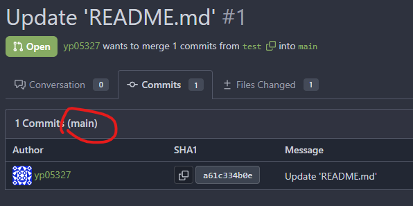
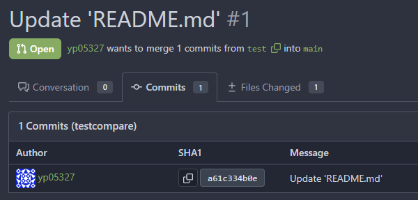
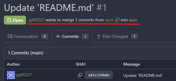
Remove ref name in PR commits page ( #25876 )
...
The branch name display here is based on the repo's default branch which
is not correct.

For example, if I changed the default branch, the branch name here will
also be changed:


you can confirm this in :
https://try.gitea.io/yp05327/testrepo/pulls/1/commits
I think we do not need to display branch name here, as we already have
the branch info above.

2023-08-24 01:31:54 +00:00
wxiaoguang
e8b990999f
Make "link-action" backend code respond correct JSON content ( #26680 )
...
Otherwise the `link-action` JS code couldn't parse the response.

Co-authored-by: Giteabot <teabot@gitea.io>
2023-08-23 17:36:57 +08:00
wxiaoguang
af33a1187b
Fix doubled box-shadow in branch dropdown menu ( #26678 )
2023-08-23 08:13:04 +00:00
yp05327
75689b8973
Improve repo sub menu ( #26531 )
...
Before:

After:

Icons are not in the middle of the line.
2023-08-22 09:20:09 +00:00
yp05327
bd8a253220
Improve show role ( #26621 )
...
Add a general show role template.
2023-08-22 05:30:33 +00:00
CaiCandong
5bd63f83e3
Improve translation of milestone filters ( #26569 )
...
https://github.com/go-gitea/gitea/issues/26567#issue-1855312074
> The terms `closest` and `furthest` don't describe the actual sorting
behavior as these two are semantically relative to the current date.
> Could we switch to `earliest` and `latest` instead?

close #26567

---------

Co-authored-by: yp05327 <576951401@qq.com>
Co-authored-by: Giteabot <teabot@gitea.io>
2023-08-21 21:11:07 +08:00
yp05327
82f6e3d845
Improve deadline icon location in milestone list page ( #26532 )
2023-08-16 16:22:25 +08:00
silverwind
3e044d2c9f
Use unique class for breadcrumb divider ( #26524 )
...
Fix regression from https://github.com/go-gitea/gitea/pull/25539 :
https://github.com/go-gitea/gitea/pull/26519#issuecomment-1678825200 .
Before:
<img width="429" alt="Screenshot 2023-08-15 at 15 46 12"
src="https://github.com/go-gitea/gitea/assets/115237/a818f60a-77a2-48fe-8e6f-363d152ccb1e ">
After:
<img width="424" alt="Screenshot 2023-08-15 at 15 46 19"
src="https://github.com/go-gitea/gitea/assets/115237/c90159e2-ced2-4a74-8a0f-a1b2b5d0b565 ">
<img width="605" alt="Screenshot 2023-08-15 at 15 56 11"
src="https://github.com/go-gitea/gitea/assets/115237/3ded6f57-86f4-422a-86cb-56dd2c216dee ">
2023-08-16 00:08:23 +00:00